Leff Strategy Studio // Branding Under the Corporate Umbrella
June 3, 2021
Ever wonder how to design a ‘new’ brand within an existing one? That’s the creative challenge I had with Leff Strategy Studio, a Chicago-based content creation studio.
I worked closely with Alia Samhat, Leff Communications’ VP of Strategy and Planning, on this project. They were looking to brand their strategy studio and its own brand, but still have it as a recognizable part of the Leff Communications family.
First thing’s first: strategy. I passed along my trusty Branding Questionnaire to uncover LSS’s goals, competitors, how the brand will be applied, inspiration, target audience, et cetera. During this discovery process, I got to know LSS’s ‘why’ so I could create visuals that align with those specific needs. Their ideal visuals were somewhere between bold & bright, sleek & minimal, luxurious & sophisticated, and modern & classic.
Alia and the folks at Leff gave me full creative control (what a dream!) and allowed me to flex my design muscles to create a few different options for their new LSS branding without too much visual direction.
Option 1, below, highlights ‘LEFF’, making it the first thing people are drawn to. It creates an association with the larger brand right off the bat. It’s in an elevated font, making it feel luxurious and shows they are an expert in their field. The secondary typeface is a serif, to give some contrast from the sophisticated primary typeface. I love this font because the ‘R’ is so playful and fun, breaking that tension and showing two sides of the LSS personality. The brand icon symbolizes the aperture of a camera, capturing an image in an otherwise dark space that is meant to remind the audience of creative inspiration. The aperture lives in a pill shape, representing a remedy for a client’s creative headache that LSS will help cure.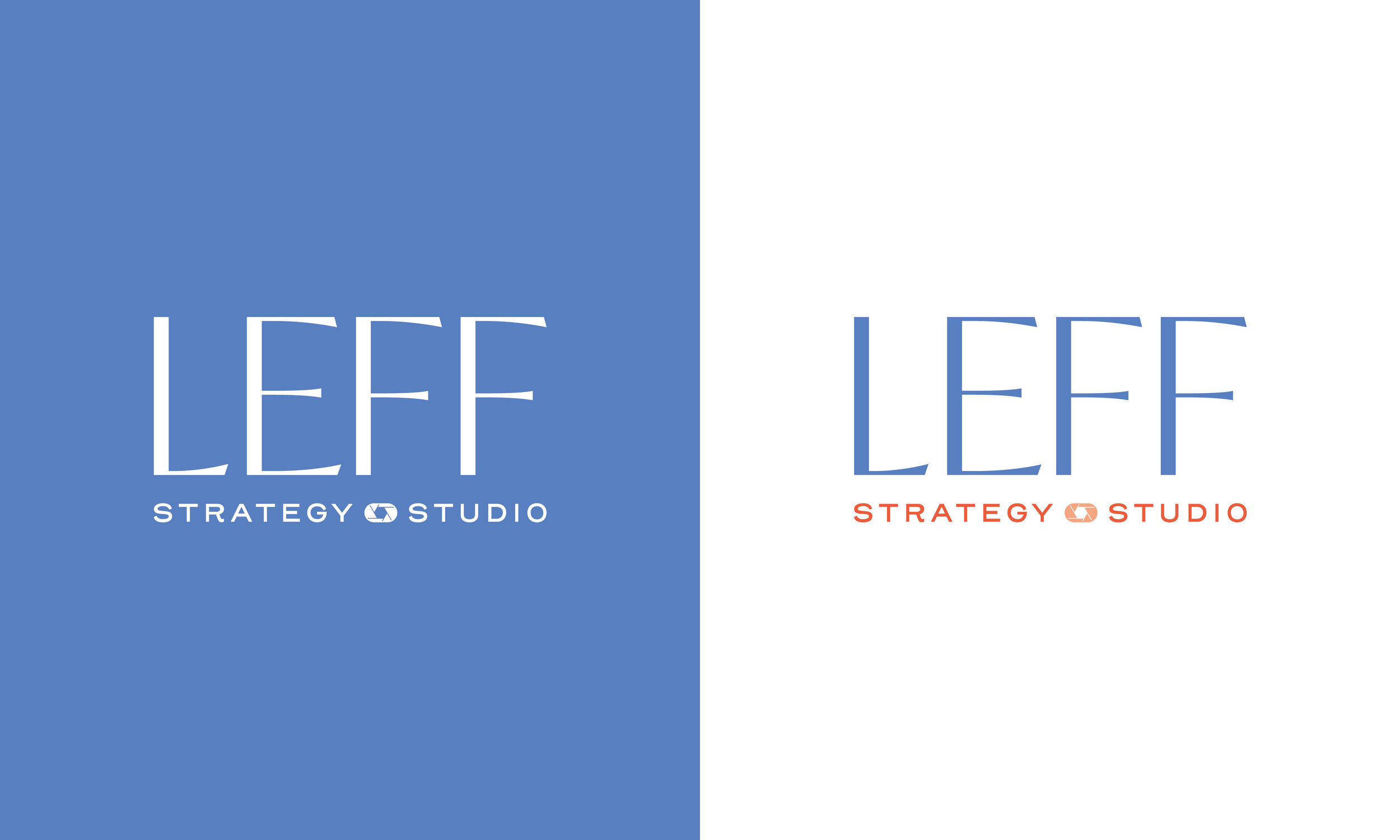
Leff Communications’ colors are teal and grey with a dash of chartreuse, coral, and green. So with this palette, I wanted to choose colors that complimented or were close to their own.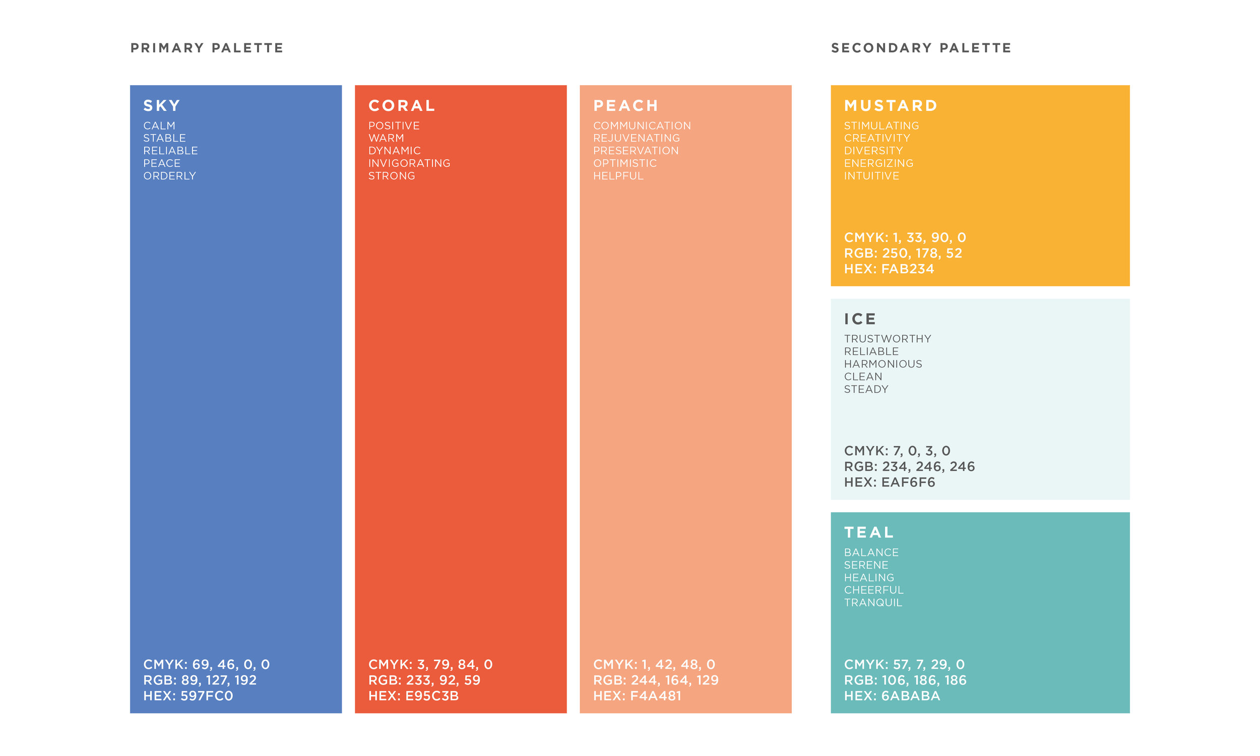
Here’s what some of Option 1’s brand elements look like together.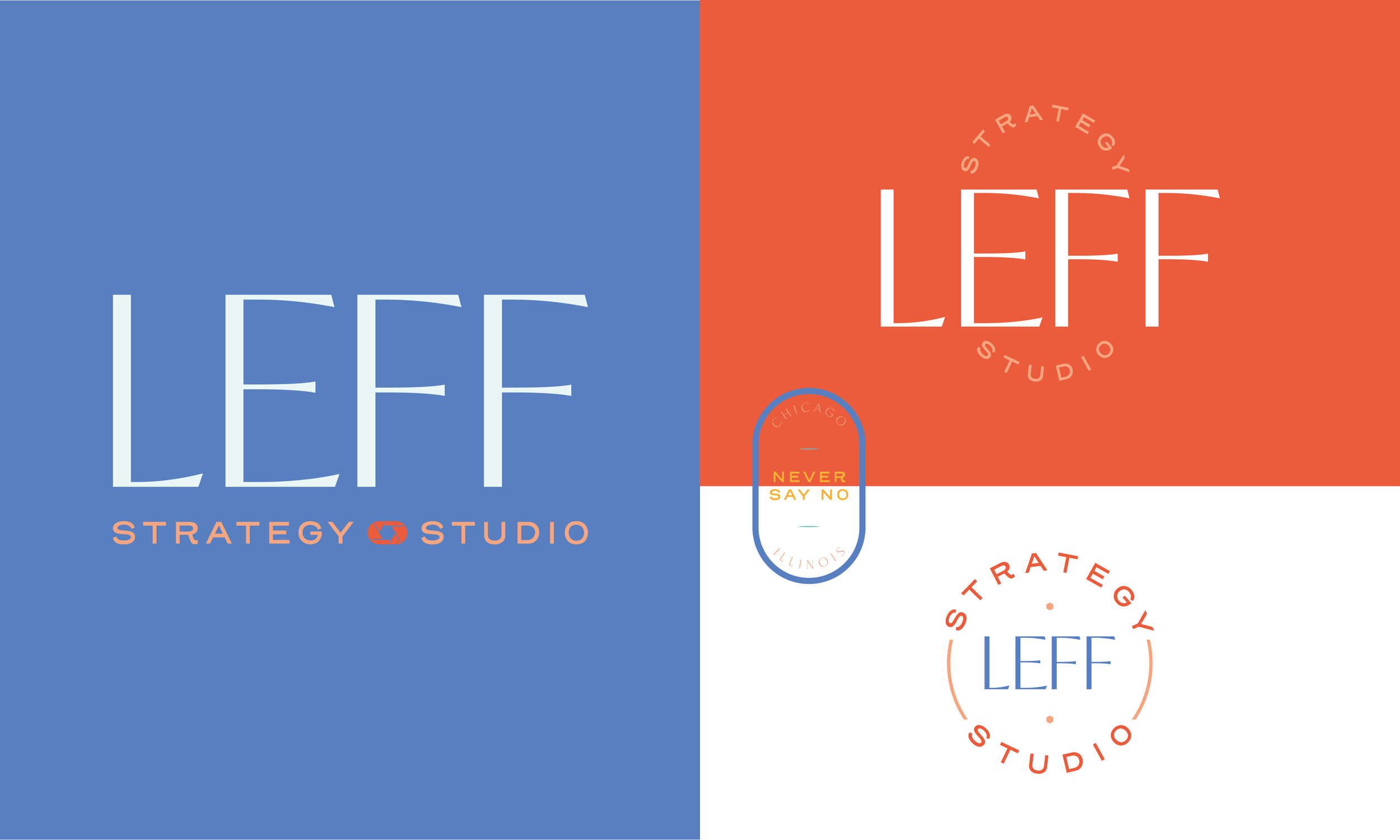
In Option 2, I wanted to include a sturdy sans serif font to run the show. It emphasizes confidence and expertise. Since it is so commanding, I wanted the secondary typeface to be all lowercase and show a bit of personality. The brand symbol combines a compass, to help find your way; a creative spark one gets during a moment of genius; and focus, to see something more clearly.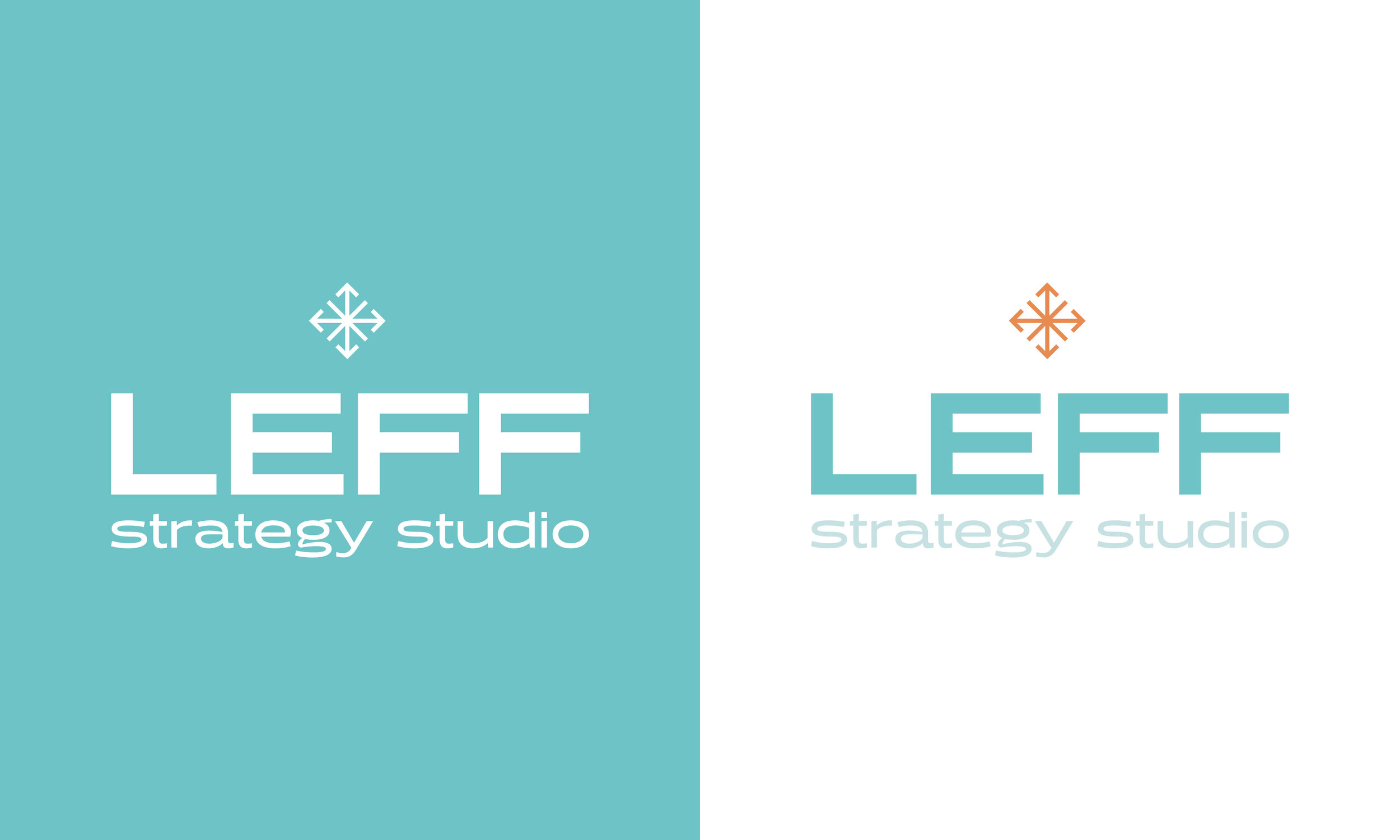
Here I used the exact Leff teal in the larger brand and brought in some complimentary green and orange.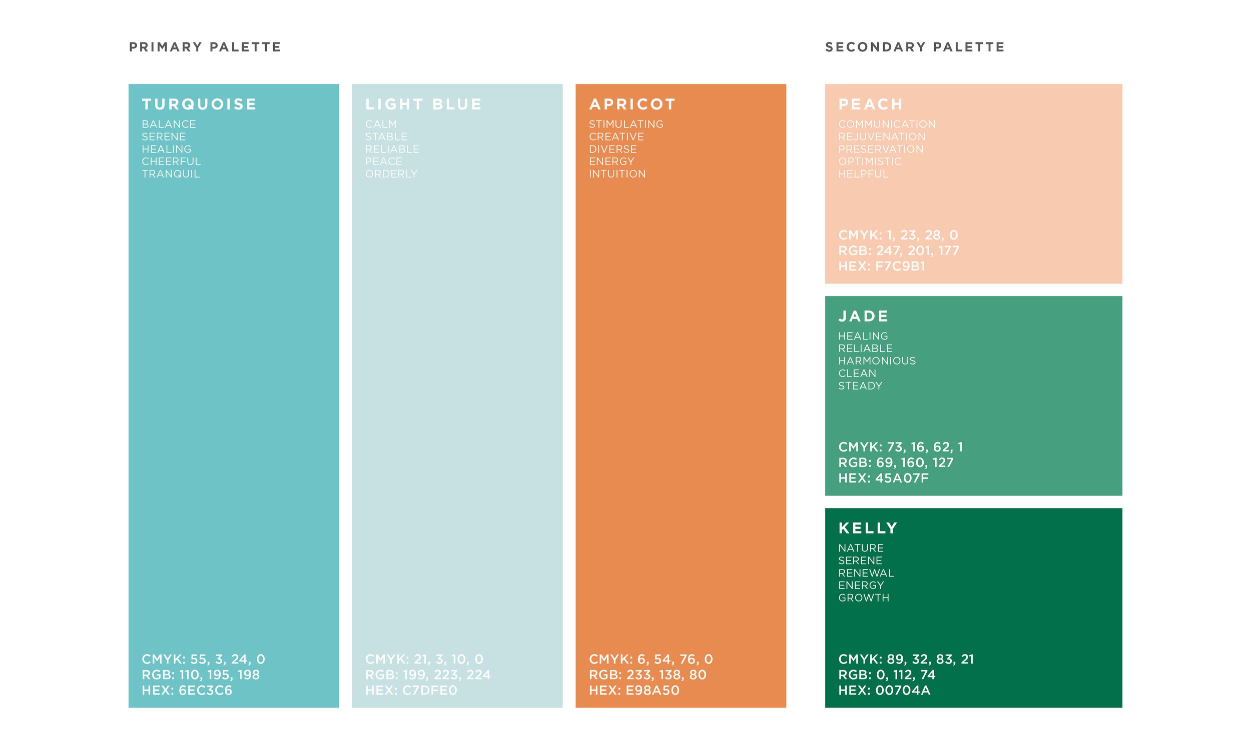
Here’s what everything looks like together: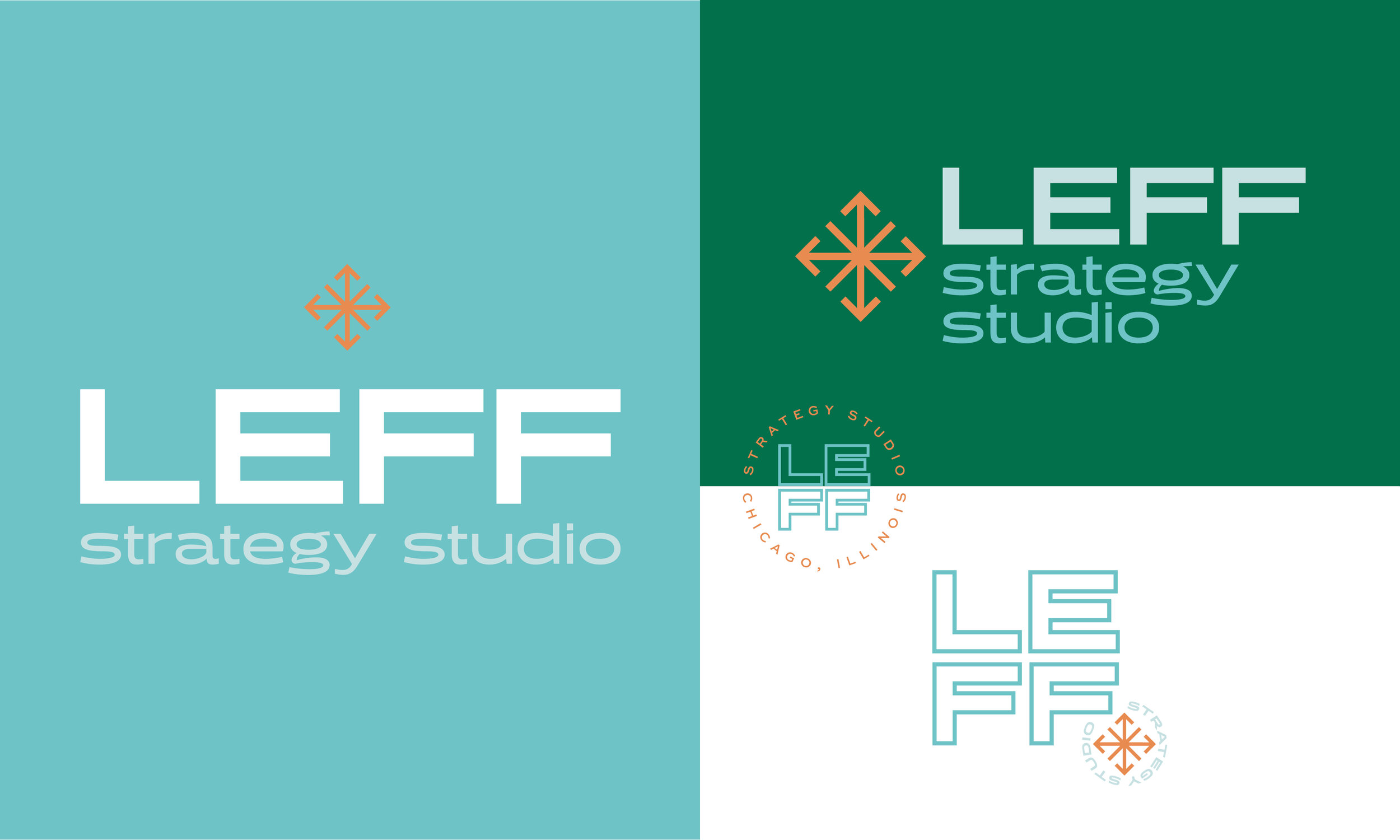
I’m a sucker for a pattern, and this symbol really asked to be one.
Option 3 harkens back to the sophistication of Option 1 but adds some drama with the shadow effect it produces. It gives the impression of Leff being in a literal spotlight. I kept it simple and modern with the secondary typeface and added another combination brand symbol, a prism encased in a perfect, whole circle. It represents an idyllic moment of creation, like gazing into a kaleidoscope.
These colors were the closest to the original Leff Communications brand, but with a darker teal as the primary color. I’m a sucker for their chartreuse, so I knew I had to include it in at least one palette. I also threw in a gradient, because they are popular right now.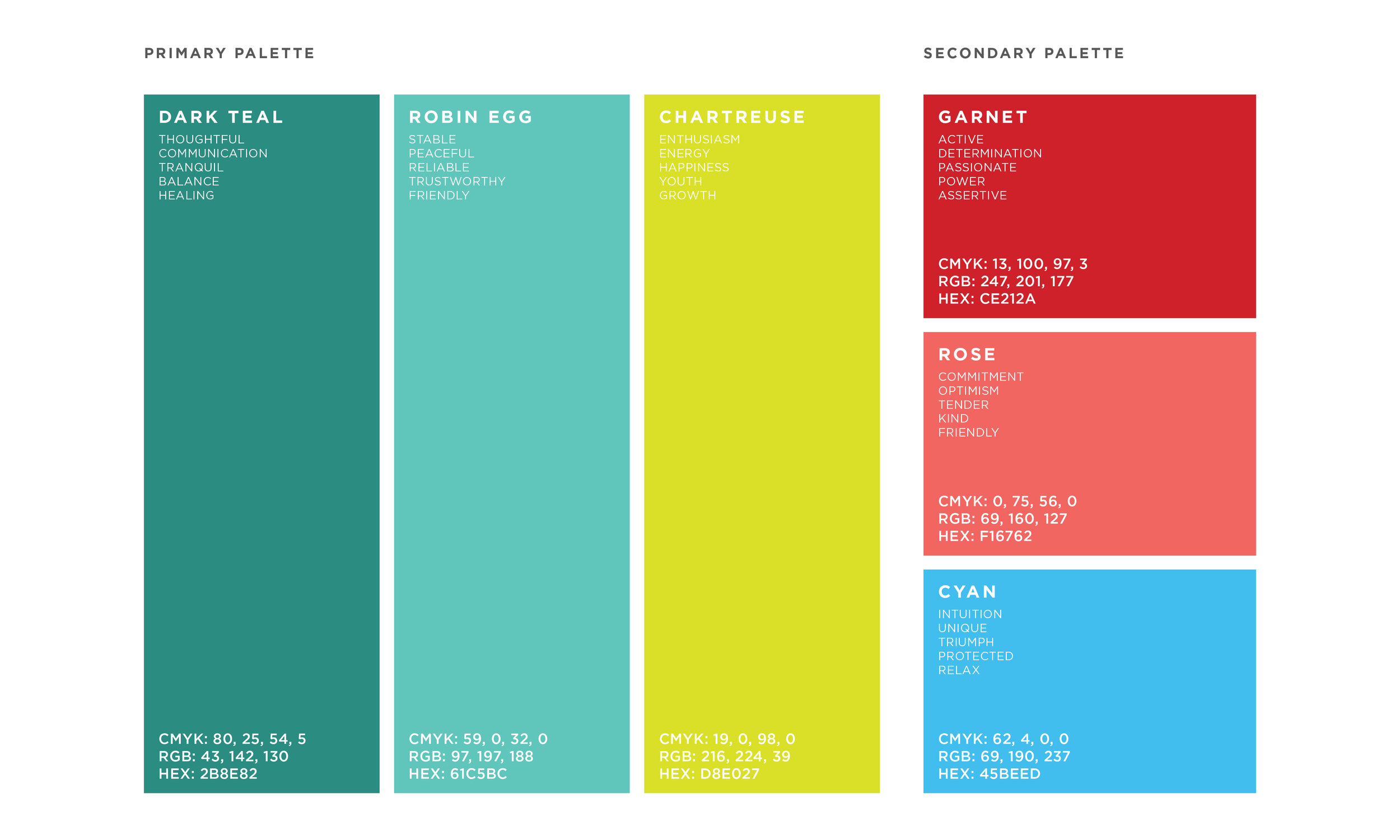
Here’s what it looks like together: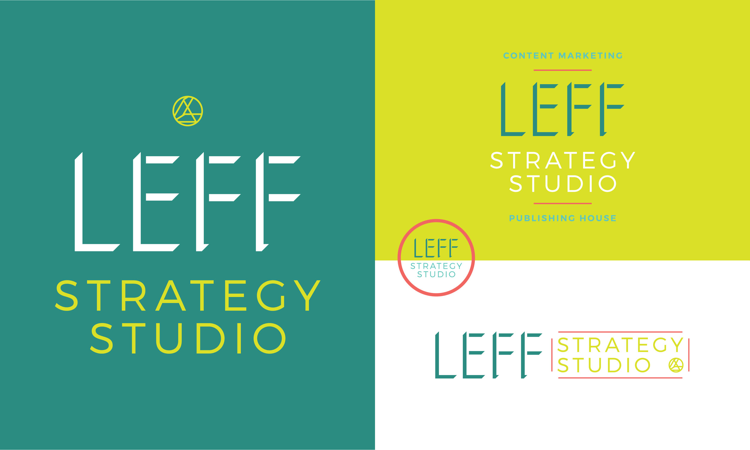
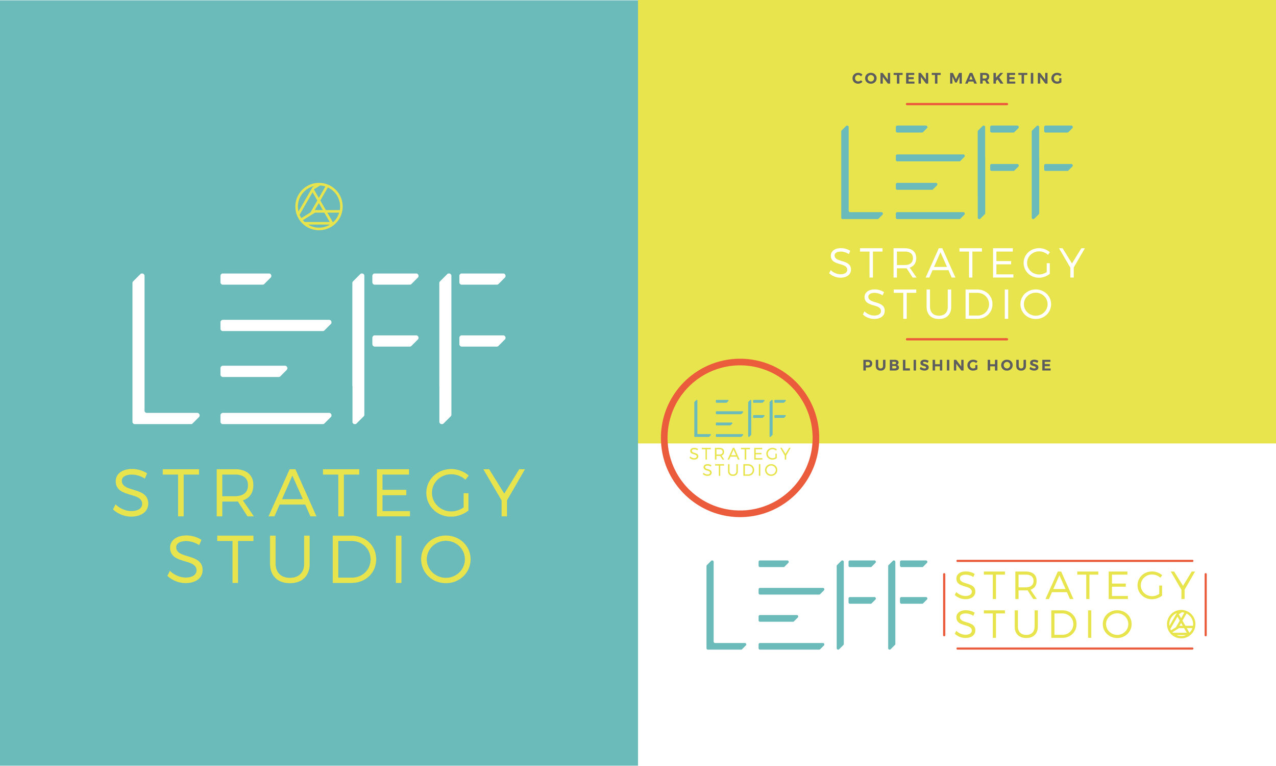
If you’ve seen the final LSS brand I made, you can probably tell that Leff ended up choosing (an edited) Option 3. In the changes process, we made the colors a bit closer to the original brand’s, customized the ‘LEFF’ text, and got rid of the gradient.
Here’s how the final brand turned out: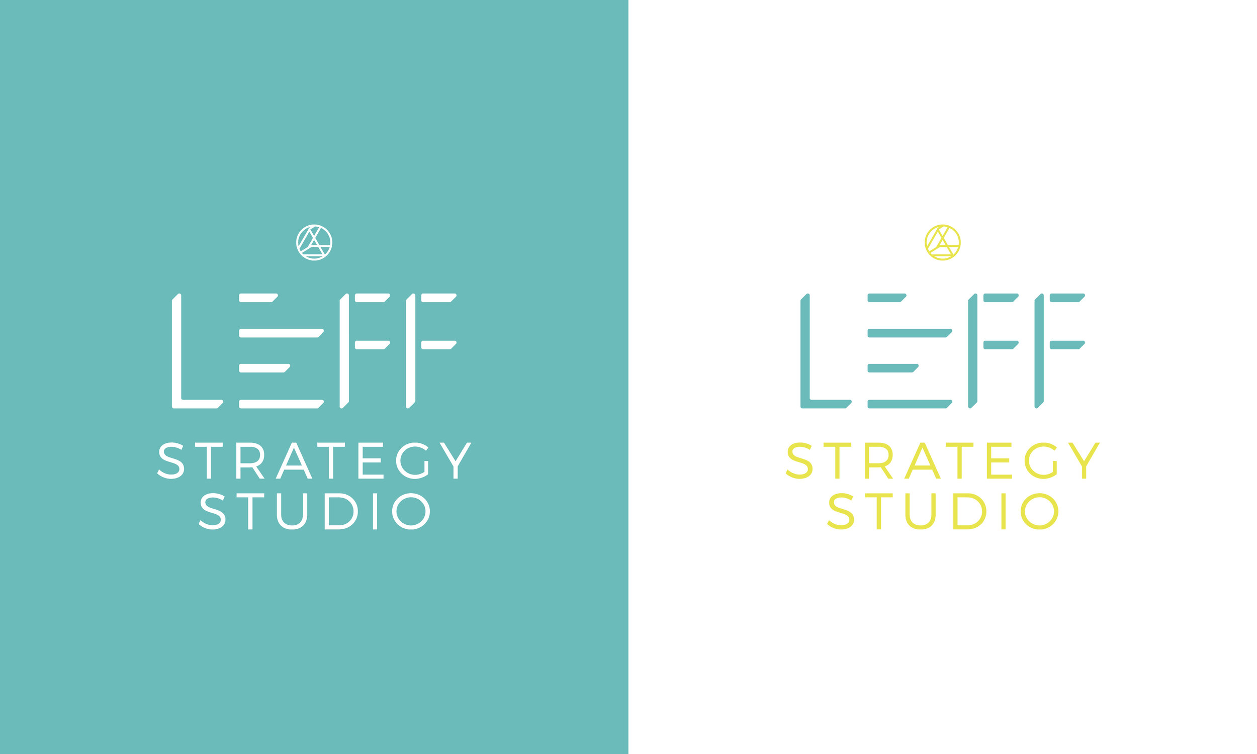
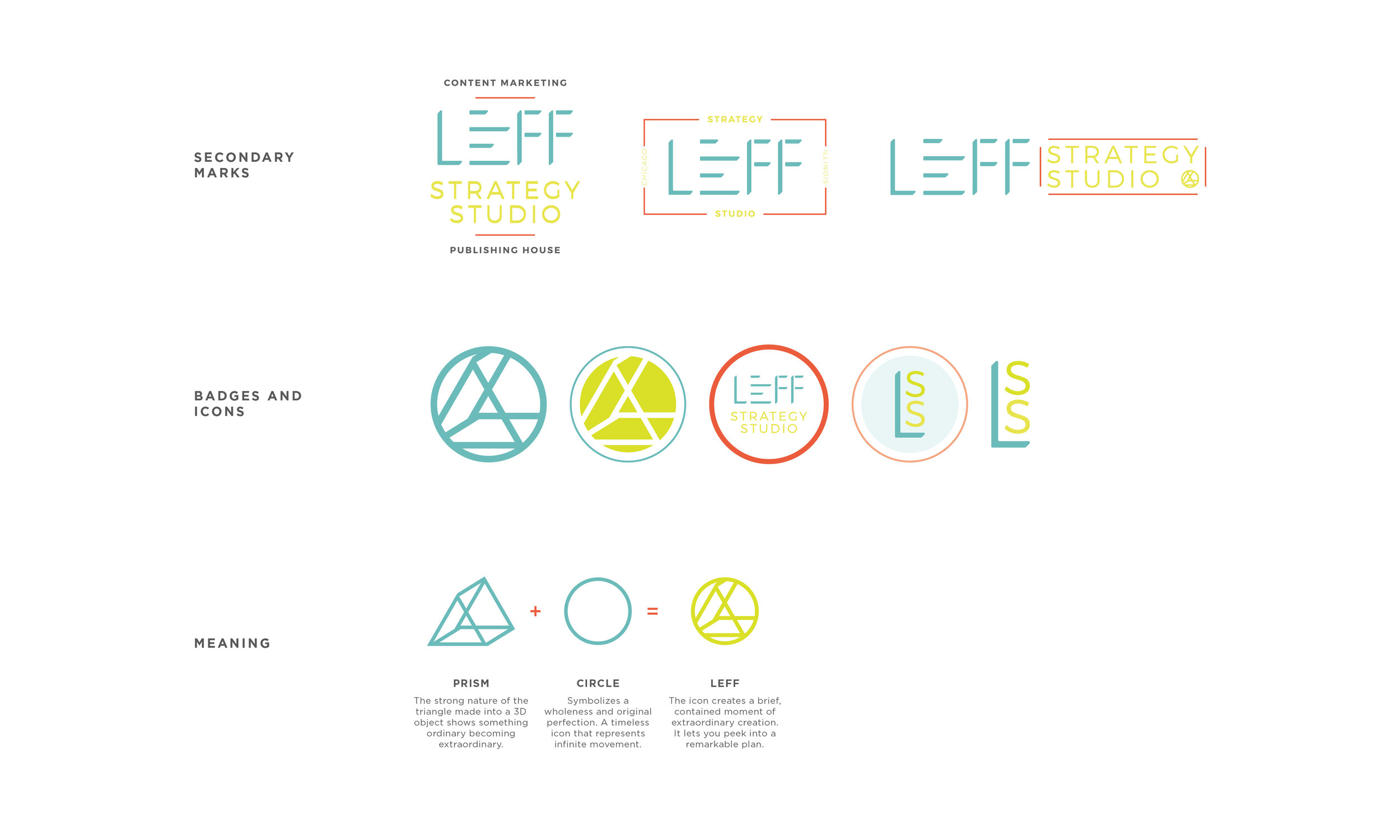
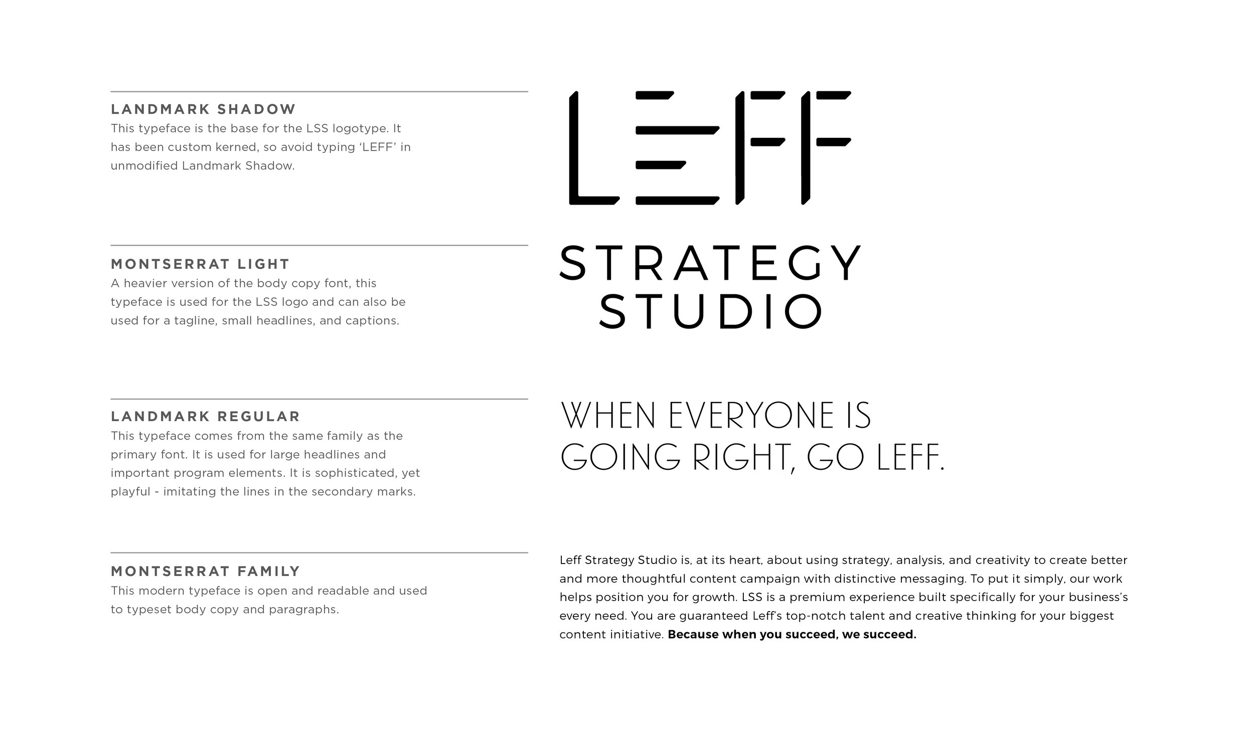
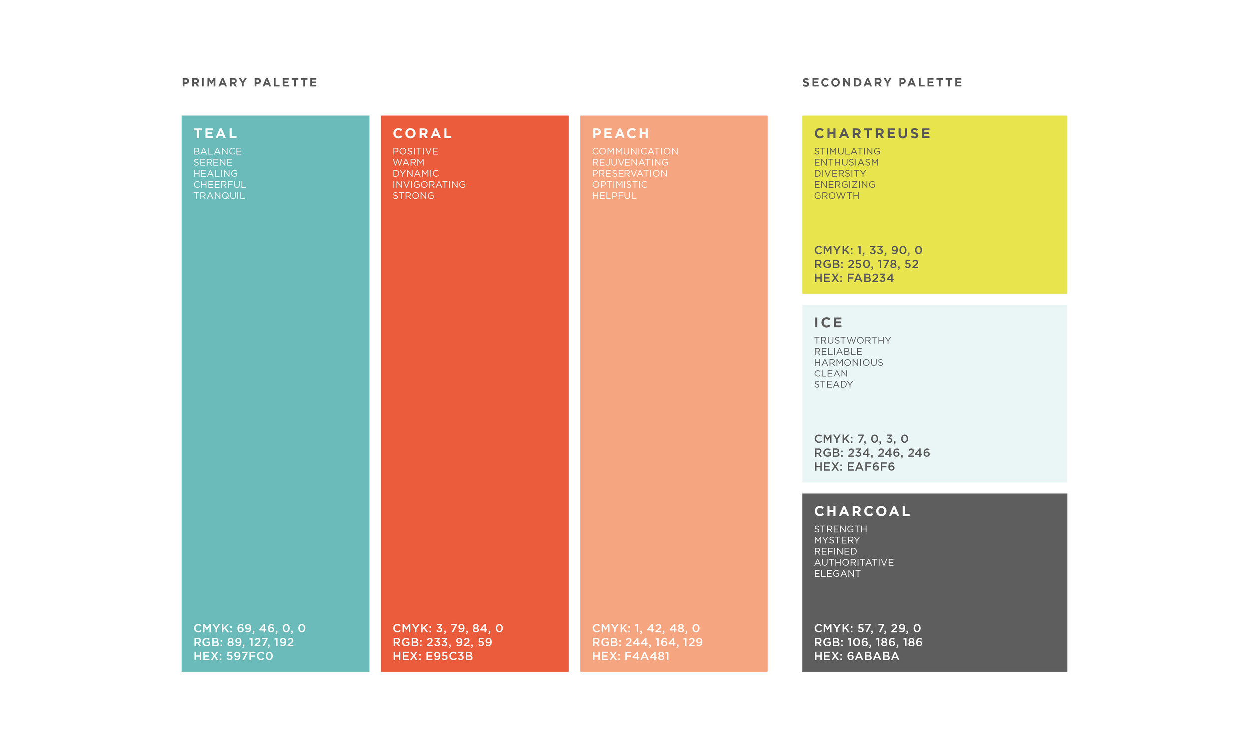
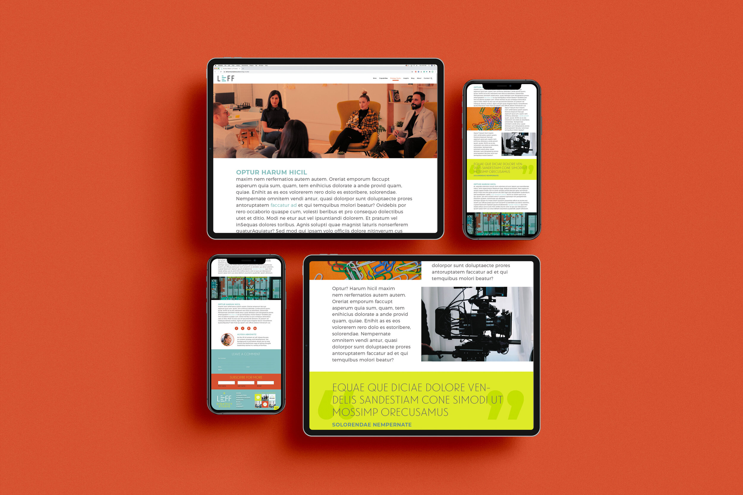
From here, Leff wanted me to take the new LSS brand and apply it to a few different projects: a web page, blog, client presentations, and a newsletter. Brand implementation is my favorite! These designs have been approved and are currently being implemented by their designers.
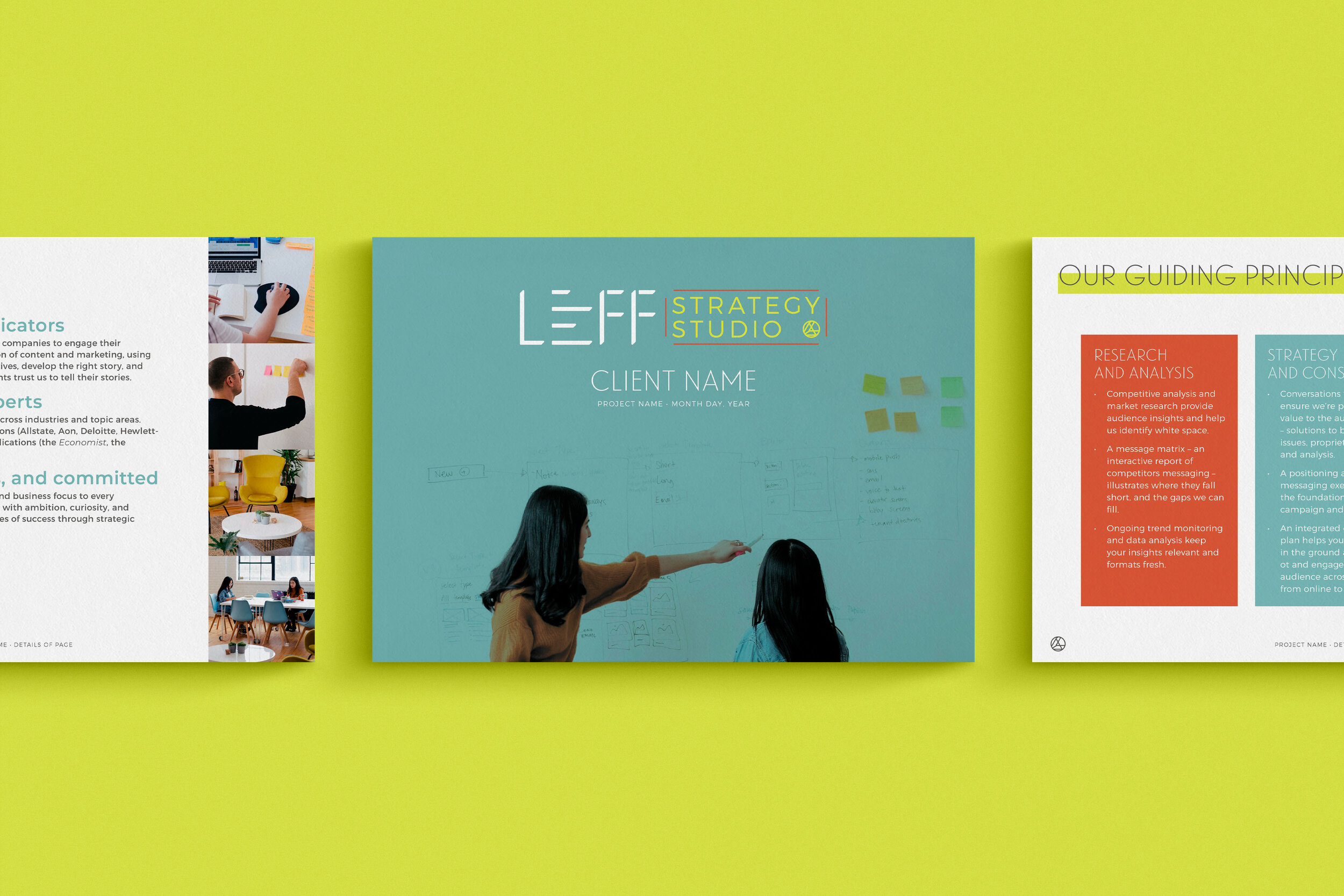
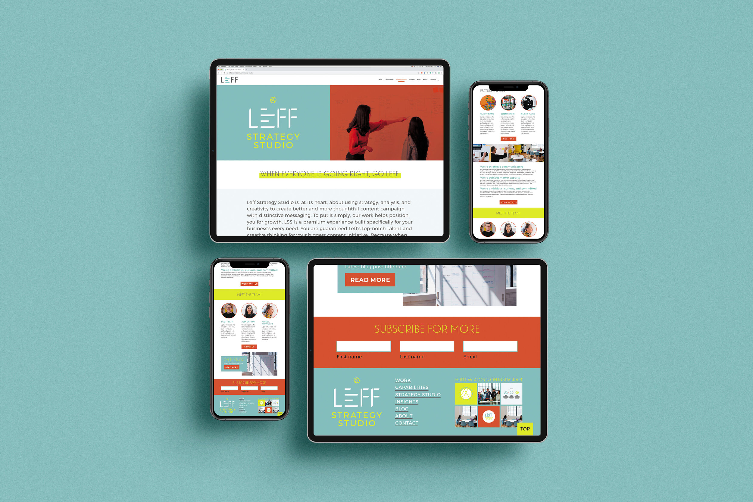
I had a ball with Alia and her team at Leff. I got to know a few of them and they’re truly a fun, open-minded, and creative bunch. I look forward to continuing this relationship with other equally energizing collateral and design solutions in the future.
See ya next time!

